

It was a Tuesday, the kind with no meetings, which should have been a gift. Instead I opened the checkout flow for a client called Nordkap, a Bergen-based outdoor gear brand launching their first direct-to-consumer app, and I stared at the ‘Continue’ button on the payment step until it stopped looking like a button at all.
The Button in Question
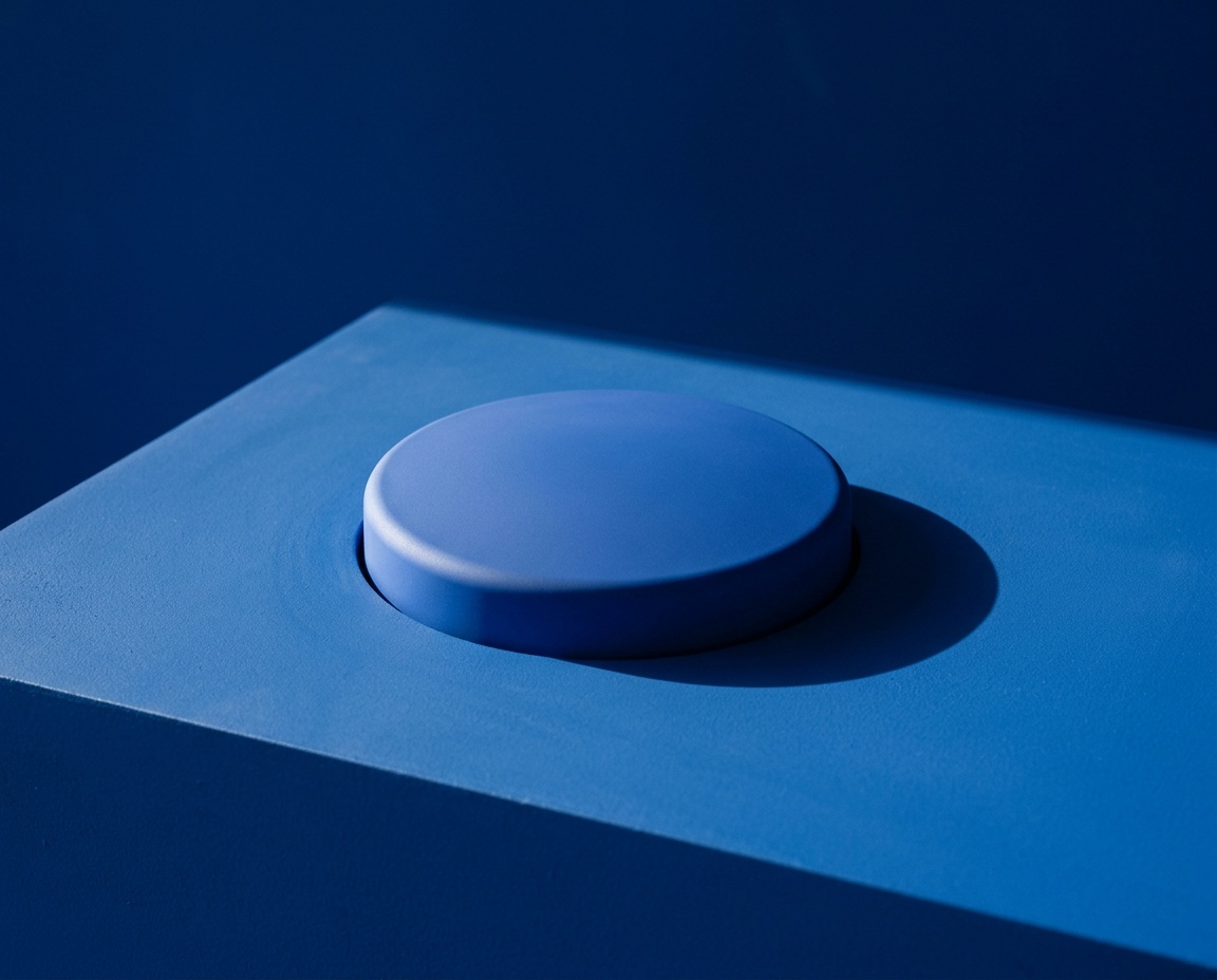
It was blue, #2F6FED, with 14px of vertical padding and a 6px corner radius. It sat at the bottom of a form that collected shipping details for a down jacket that cost 2,400 kroner. Nobody on the Nordkap team had asked me to touch it. The analytics showed a 91% completion rate on that screen, which for a checkout flow is close to excellent.
What It Looked Like Before
I had designed it three weeks earlier, approved it, shipped it to development, and watched it go live without a single comment in the Slack channel. By every measure I use to judge a button, it was done.
Why I Touched It At All
I opened the file because I was avoiding a harder task: writing the empty state copy for a search page that returned zero results, which required me to think about failure in a way I didn’t feel like thinking about that day. The button was sitting right there in the same file, calm and finished, and some part of my brain decided it needed one more look.
I told myself I was checking contrast. The ratio was 4.52:1 against white, which clears WCAG AA for normal text with room to spare. That check took ninety seconds. I kept going anyway.
The Four Versions
Over the next three hours I made four variations of a button that had already shipped:
- Version one: corner radius up to 8px, padding unchanged.
- Version two: a darker blue, #1C4ED8, with the same radius as the original.
- Version three: the original color and radius, but the label changed from ‘Continue’ to ‘Review Order’.
- Version four: everything reverted except the padding, now 16px instead of 14px.
I renamed the file four times too. By the end it was called Checkout_v14_final_FINAL.fig, which is its own kind of confession.
The Moment I Caught Myself
I pulled version four up next to the live version and switched between them for a full minute, looking for a difference I could defend to anyone, including myself. There wasn’t one. The two pixels of padding changed nothing a user would ever consciously register.
A button that works is not a problem waiting to be solved. It is a decision you already made, and revisiting it without new information is just anxiety wearing a designer’s clothes.
I said that sentence out loud to my empty studio, which is embarrassing to admit, but it’s also the moment the afternoon actually turned into something useful.
What the Button Taught Me
The honest answer was that I didn’t want to write the empty state copy because I hadn’t figured out what tone Nordkap should take when a customer searches for a product the brand doesn’t carry. That’s a real problem. The button was a fake one, dressed up to look urgent because it was in front of me and solvable in small, satisfying increments.
The Pattern Underneath It
I’ve since noticed the same move in at least a dozen other projects: a spacing tweak that appears right before a hard writing task, a color audit that starts the day a client meeting feels unresolved, a ‘quick pass’ on icons that lasts until 6pm. The tell is always the same. The thing I’m fixing already works, and the thing I’m avoiding doesn’t exist yet.
None of this means polish is bad. Some of my best work has come from going back to something finished and finding the one detail that was actually wrong. The difference is whether I can name, specifically, what was broken before I started touching it.
A Rule I Made Afterward
Now, before I open a file that’s already shipped, I write one sentence describing the problem I’m about to solve. If I can’t write that sentence in under thirty seconds, I close the file and go back to whatever I was avoiding. The button stayed exactly as it was. The empty state copy, once I finally sat down and wrote it, took forty minutes and turned out fine.


